Thursday, March 1, 2012
Mid-term Portfolio
Kirksville Arts Association poster and web banner: I spent 5 hours on this total. I only had to rework my original design 3 times. I was under budget for this poster (6 hours). This poster was one of those pieces where I came up with a design in a hurry and put it together and it turned out well. My natural design instincts came out and i produced this. I like this poster, i think that its engaging and would get students attention....which was the point :)
Time magazine spread: 7.5 hours on this layout. the budget was 6 hours so i went over budget :(. I think the reason that i went over budget was because it took me so long to get started on this layout. I couldnt come up with any good ideas or concepts. I just kept brainstorming and researching. i did about 3 rough layouts on this piece till i scraped them all and did this layout. I only had a rework this layout 3 times, which is great considering how much time i spent thinking about it, and i didn't spend more than 2 hours on all the reworking. This is one of my favorite pieces from the semester (which is why i also printed it!)
Monotype poster and website layout: 8 hours and i had a budget of 6 hours. yikes! i keep going over! but its not by that much......This layout i reworked 5 times from the original poster. This poster has all to do with type layout and grid structure....something that is not my forte. however i think that i have gotten better over the course of this semester...but considering that this layout was our first assignment and my typography sucked.....its no wonder i went over budget :(
Jazz combo concert poster and iPad layouts: 10 hours total for the iPad layouts and the poster with all the reworks. and hey! i was on budget!! sweet :) This is my favorite poster. I love when our resources are limited. to only use black and one spot color and to be able to only use a vector graphic tests my ability and it makes me work harder. Any one can design a poster with photos and full color, or at least its easier for me. When you have certain parameters as a designer, it makes you push the design so much further.
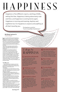
Happiness newspaper layout: 6 hour budget on this and i spent 10 hours :/ This was a headache of a layout! i spend 4 hours reworking 9 layouts for this project. I had certain components working for me in this layout, like the typographical lips and the word bubble, but i couldnt for the life of me get them both to work in the overall layout! SO FRUSTRATING! I almost want to say that i got this approved because Rusty was tired of looking at it......but i think that this layout has come a long way from the beginning stages to the final piece.
Summer block course promotion poster and iPad layouts: I spent 7 hours on this and the budget was 7 hours. over my allotted time again...This was a fun poster and layout to do. My brother had thousands of picture from his trip to the Tetons and Yellowstone so i used his photos, which worked great! This was my favorite concept that i had in a poster and the elements fit really well with the concept and i think this poster is very cohesive.
Native American Heritage Month poster and animated web banner: On budget for this project! i spend 6 hours total with the poster design and the banner. This is my best piece that i have designed this semester. This layout is just like the KAA poster. it was one of those times where i was stressed for time and had to put something together. i came up with a concept and just put the poster together in a couple of hours. I'm starting to sense that my best work comes from when my design intuition takes over.
Detours magazine spread: I spent 8 hours on this spread with revisions included...and i came in under budget 2 hours! When i first did the layout for this, i squished all the content on 1 spread. whoops. So having to add 2 more pages to this was hard because there was so little type to work with. I think the banner of pictures on the 3rd and 4th pages work really well and this layout is simple but visually pleasing.
Self-reflection blurb - I'm really proud of myself for how i worked in this class over the semester so far. I didn't wait till the last minute to get all my approvals, in fact i got most of my things approved about a week before the mid-term portfolio was due. I worked hard every week and i think that my hard work shows in each project thus far. And the goal that i am trying to get at over the course of the semester is to try and get things approved the first time around. Well that hasn't happened yet, but i definitely got closer to less revisions and hopefully by the end of the semester i can reach my goal of getting projects approved the first go around :)
Subscribe to:
Post Comments (Atom)


No comments:
Post a Comment