Wednesday, February 22, 2012
HAPPY...... that i got this approved!
Rusty has reluctantly approved this layout...but i would have to say that i have most definitely worked the hardest on this layout to get it approved. also compared to the original layout, this is like Michelangelo work. its come such a long way and it looks good. I have many elements that are working and they finally came together in this layout.
Monday, February 20, 2012
Only I can design this....
This is a series of 3 posters for the smoky the bear "prevent forest fires" campaign. kind of a disaster i know. i really like the imagery but i need a solid concept. can i even work backwards from developing the concept from the imagery? uggg. well i have 6 approved so i dont really need to work this one out...right?
Wednesday, February 15, 2012
Just because its approved, doesnt mean its A material....
more approvals! but i guess it means that they are C material....so i have to work on my approvals now to get them to be more than C's.....AHHHHHHHHHH oh and i have to do all those website banners and animated things and iPad layouts for the approval items.....and only 2 weeks till midterm!
Stressed?? this is easy!
5 spprovals?!?! sweet! this article talks about that every viscom major does. we talk about how stressed we are and how we have so many things to do.....and we don't do anything about it. at least that's what i do...
but im on my way to those 8 approved projects for midterm.....3 more!
but im on my way to those 8 approved projects for midterm.....3 more!
Monday, February 13, 2012
Stress = Viscom
Time magazine spread. This article relates to my viscom life so well! i have 7 projects still waiting to be approved and its so freaking stressful. thank goodness that rusty likes this and hopefully it wont take long to get approved! fingers crossed....
ANDDDDD......another one!
Approval number 4!!! I love this poster! I feel like my best work is the work that I do when im in a time crunch and i have to throw something together and i don't think about it so much. So this design (or the original concept) is the result of staying up sunday night for a couple hours rushing to get these posters done. the concept and the type and imagery all came together so well! yay!
Monday, February 6, 2012
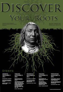
Native American poster
Native American Heritage Month posters. one concept for all three posters. I almost got this approved the first time! some minor adjustments but i think this can end up really well!
Improving and approving!!
Third approval!! yay! as the projects keep piling up im banging them out....one at a time tho...lets see if i can get more than one approved at a time...or just get them approved the first go around!....hah...
Friday, February 3, 2012
Approval number 2! bam!
Im not posting very much progress....just posting the original layout/design and the final approved one. I think thats really the only important layouts...but i am keeping my designs in between! im just glad i dont have to have a process book!!!
Anyway! here is my FINAL APPROVED layout of my Jazz poster :) I really like the way that it turned out! :) only took 2 weeks.
Anyway! here is my FINAL APPROVED layout of my Jazz poster :) I really like the way that it turned out! :) only took 2 weeks.
i like herp....ATOLOGY!
I thought my tag line was pretty good....rusty didnt agree but i can keep it at least. The whole diagonal thing going on is throwing off my type layout.....I need to make the tagline and open house more dominate. Image = great. type = needs work.
Lets take a Detour....
So 2 spreads mean 4 pages. Right...ill remember that. so i squished all this freaking type onto one page. good. BUT i like the first page, and i think that my grids are looking good here so i just gotta continue that on for the other 2 pages ill make. I'm making progress yay!
KAA poster
This poster is for the Red Barn Arts and Crafts Festival in Kirksville. I really like this concept! just the text hasn't all come together yet...but still working!
Subscribe to:
Comments (Atom)


